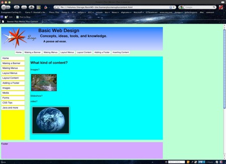
Adding space for content and the footer...
The Content
When we define the height and width of our content area the normal flow of the xhtml, as interpreted by any browser, will place the content below the vertical menus... I used arbitrary background colors to let us see the different components positions.To position the "content" div on the page all we need to do is move it from its relative position by using top and left dimensions...
The position of any div is measured from the top left corner...
The Footer
Same as the content... we'll have to move it from it's "normal" flow or position to place it at the bottom of the navigation and content columns.The page
You'll notice that the page is "glued to the left side of your browser, you might not notice that if you are using a 4:3 old style monitor. But, you'll see that right off on a wide screen 16:9 monitor!The Puzzle for the day?
Center the web page. (yes, we are ignoring the "content" of the "content div" for now!)Click on the Image below to load the page into a browser

No comments:
Post a Comment